
Another interesting phenomenon of light is that it is the whitest it will ever be at its first reflection. For example, imagine light hitting rocks at noon when the light is whitest. This beam of light then reflects off another rock and as it does drops down a wavelength to a warm yellow. This light then bounces off another rock and drops another wavelength to orange and so on until in the deep recesses of the rock the reflected light might be a deep purple.
Some color theorists see complementary colors in shadows. For example, if the light is a lemon yellow the shadow would have a warm purple cast. In the western United States when we have one of our periodic forest fires the light becomes extremely orange as it is filtered through veils of smoke. At such times the shadows become an extremely bright cerulean blue. This could be the result of the smoke diffracting the blue sky and backwashing the bright blue into the shadows. But because the blue is so intense I suspect this phenomenon is partly an optical effect of the complementary color being projected into the shadow (otherwise known as field effects. See chapter x). Ultimately I agree with John F. Carlson who suggests that if you see complementary color in shadow by all means paint it in.
Given that shadow complementarity might be an interesting effect to include in your paintings from purely aesthetic reasons I prefer to keep my shadows complex by using at least two colors. For example, if I'm painting objects in a very orange light a reasonable field effect might suggest a blue shadow. But I find it more interesting if this blue is split into warm and cool versions. Because of the tendency of opposing colors to neutralize themselves the split can be quite diverse and still maintain a similitude of reality. For example I could paint the shadow with broken color comprised of a Thalo Blue warmed with a dash of Cadmium Yellow and a cool Dioxazine Purple. This would give the illusion of a bluish shadow but with a complimentary field effect.
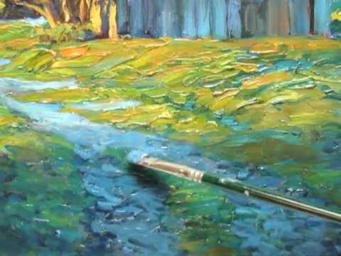
Another aspect of painting the effect of light is that a surface will look more illuminated if it is painted with a lot of texture. Conversely, a shadow will look deeper and more convincing if it is painted thinly. Since everything is relative if you use a lot of thick paint in the lights you can use some texture in the shadows (it can look a bit odd if your lights are very textured and your shadows and reflections have no texture at all). To get a lot of textures in my lights I frequently use Gamblin's Lead White Replacement which, like its namesake, is very thick and will preserve the texture of your brushstrokes quite nicely (with the added benefit that it contains no lead). Another color I like is Gamblin's Radiant Lemon which is a hue of an eight value but is very useful (hues are pre-mixtures of basic colors, in this case Cadmium Lemon with Titanium White. The pre-mixture is a convenience to save time). Another great color to paint light is Gamblin's Transparent Orange, another hue, but it is a nice replacement for Indian Yellow (which I find has a slightly neutralizing gray undertone). To help keep shadows thin I will occasionally add M. Graham's walnut oil or Gamblin's Neo Megilp (which dries faster) to minimize and flatten strokes.
THE COLOR OF TREES
There are few things I enjoy painting more than trees. There is something just as mysterious and inviting about a cluster of trees as there is about a lone tree. It might be subtle value shifts, one of the hallmarks of true beauty, that intrigue me. But the same reasons that invite me to paint trees, their mystery, subtlety, and majesty, also makes them extremely difficult to paint.
The first and most important aspect of a tree, easy to overlook in bright glare, is that the main mass of a tree is basically one value. This is difficult to absorb because when you're looking at a tree it appears as though every value is represented in its form. But take the nine value grayscale outside and carefully note the values. You will be surprised at the closeness of the value range. The light and dark are often subtle variations of one basic value. Many people make the mistake of painting the foliage too light on one side. Or worse painting dabs of light all over the illuminated foliage. This gives a spotty, fractured look to what should read as one large shape (or value zone).

YOU ARE READING
The ART of THICK PAINT
Non-FictionSpeed your painting journey by knowing the best techniques. Brad Teare expands and adds to the best of his Thick Paint Blog-a site dedicated to painting with thick texture.
13. The Joy of Color
Start from the beginning
